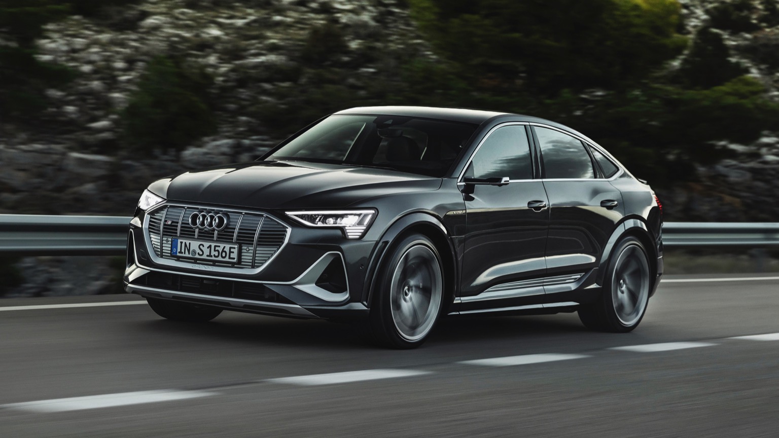
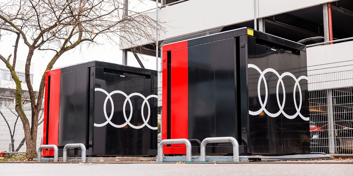
Audi since the days of Auto Union uses the legendary four-ring logo. However, from now on the logo will be replaced to signify the era of electrification.
Audi has expanded on its logo when it introduced the revamped and renamed Q8 e-tron. Designed to give off a “more modern image”, the new logo features a black background that contrasts with a white ring for a more elegant look.
The two-dimensional appearance of the logo makes it look clearer even from a distance. With the new logo, there is no longer the chrome logo that used to be the hallmark of Audi. The two-dimensional logo design is an attempt to make digitization easier.
The reason is, Audi wants its logo to look the same everywhere, whether it’s in magazines, smartphone screens, billboards, or in the car.
In addition to the new logo, the upcoming model will use a proprietary font known as Audi Type. According to the designer, Andre Georgi, these changes still maintain the elegant style and quality of the Audi brand.


